For a lot of new photo booth owners, the idea of creating customized templates for their clients is overwhelming. Everyone has varying levels of Photoshop or design experience, or maybe you don't have any at all.
Have no fear - by the end of this article you'll be designing beautiful templates for your clients and mastering your workflow in no time!
The WOW Factor
We've talked a lot about the importance of standing out from the sea of photo booth companies, right? Things like the customer experience you provide at events, for example, aim to get you more repeat customers.
However, you also need some sort of "WOW factor" that makes you and your photo booth business stand out before clients have a chance to work with you.

This is where the importance of template design comes in.
Commit to creating wow moments.
- Trish Lee from Fotomoji
By dedicating time to creating beautiful, personalized print templates for your photo booth, you're immediately setting your photo booth business apart. Not only will clients appreciate the beautiful design, but these designs are another form of marketing.
If you were to attend an event and come home with a fun, photo booth print, where would you put it? On your fridge? On your desk at work? Maybe you even frame it and hang it in your home?
The point is that you would put that print on display, right? This allows the world to see that print and ask about where it came from.
Who doesn't love free advertising?
Pricing Your Custom Template Designs
As I mentioned, you want to make your photo booth business stand out from the rest and custom designs are a great way to do so. So, how much should you charge for these designs?
It's easy. You shouldn't.
The pricing packages that you offer should already have the price of custom designs built-in - be sure to factor in the perceived value of the custom design and the time you take to design it (or the cost of outsourcing the template).

Will this make your packages cost more?
Well, I suppose so.
Will it make you stand out and ensure that every print that makes its way into the world is a stunning representation of the work you do?
Yes, 100% yes!
Remember, it's okay to charge more than your competitors as long as you offer more value than they do.
You Know What They Say About Assuming ...
Perhaps one of the reasons that you don't offer custom designs, or hate doing it, is because you don't know exactly what your clients want or how to ask them.
You should never assume what it is the client wants. You know what they say after all ...
So, how should you find out?
Well, creating an easy to understand form that they can fill out will make it simple for them, but provide you with enough details to capture their vision.
So, what questions should you ask? Here's an example of some questions you could use:
- First and last name
- Company/Bride and Groom's name(s)
- Email address
- Event
- Date of event
- Preferred template layout * (More on this in a second ...) *
- Event theme / colors
- Type of backdrop
- Text to be included on the template
- Any special instructions
These questions are simple enough and shouldn't overwhelm your client. At the same time, they're giving you enough information to be able to create a beautiful design.
One thing that Trish Lee from Fotomoji does, that I think is just amazing, is display the template layout options below the form. This allows clients to select a layout and gives you something to design around.

By giving customers template layout options you're saving yourself some time as you won't have to create them completely from scratch. This will allow you to have some generic templates saved that you can then go and edit with ease.
Just make sure that you send out this form a few weeks before the event. Generally speaking, four weeks out is a good amount of time.
Another way that you can get inspiration from your client is by asking them if they have a Pinterest board for their event. If they've pinned something to their board it's because they love it, after all!
If they don't use Pinterest, that's okay! Your client, or the event planner, might also have a design package that you could request.
The Big, Scary Photoshop
For some of you, Photoshop may not be scary at all. Maybe you have years of experience designing templates or you're familiar enough to create beautiful work for your clients.
Whether you're an experienced Photoshop pro or have never even opened it, I have a few resources you could check out that will definitely help your workflow.
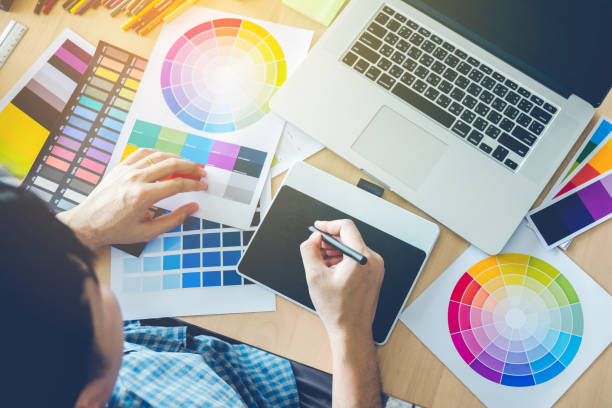
Websites and apps like Over, Canva, Snappa, and Stencil will allow you to create beautiful designs either using their web interface or their mobile app. They're incredibly simple to use and some of them, like Over, even mimic the Photoshop experience by allowing you to create layers.
With Over, for example, after you've created a beautiful design, you're able to export the PNG transparent image file, which will then allow you to make any tweaks, big or small, in Photoshop or your image editor of choice.
Stock Images
If you're a more seasoned Photoshop user and prefer to create your own designs, don't worry. We've got your back.
Since you're not using one of the previously mentioned design apps, you're likely going to be looking for stock images and designs, right?
Some of our favorites have been iStock, Shutter Stock, and Creative Market.
All of these websites will provide you with thousands of beautiful stock images that you can use for a monthly fee.
With that said, I still do recommend that even the Photoshop pros check out the design apps listed above. You may be able to save some money using their stock images versus paying for a costly subscription on one of the other sites.
What NOT To Do
While designing templates for your clients, there are a few things you should watch out for.
1) Don't Stretch The Logo
Please, please, please, don't stretch the company logo if you're working with a corporate client. Companies spend a ton of money on marketing and brand identity. Changing their logo in any way, shape, or form is a big no-no!
2) Kern Your Fonts!
This is a really important one, especially if you're using script fonts. Script fonts are made to have all of the letters close together; it's mimicking cursive writing. On the flip side, modern fonts are usually made to have some white space in between the letters.
Moral of the story, make sure you kern your fonts properly. It can make a bigger difference than you think.

3) Stay Away from Copyrighted Images
Sometimes clients will be hosting themed parties and sometimes those themes will be copyrighted. Stay away from using copyright images!
For example, let's say your client is having a Disney themed wedding. Sure, you could go ahead and put Disney characters on your print templates, but be prepared for a potential lawsuit if you or your client don't have the proper licenses.
It's really not worth the headache.
One thing you could do, however, is put something similar on the print template. Let's say they're having a Lion King-themed event, cool!
Instead of using images directly from Disney, you could put a silhouette of a lion or some African-inspired images. These images would not be copyright to Disney and would allow you to design in accordance with the event's theme without putting you or your company at risk.
And that's it! We hope that these six easy steps help you to master your template design and workflow. Have fun, make it your own, and don't forget that wow factor!
Want to learn more tips and tricks on how to have a successful photo booth business?
Check out our other blog posts and our 2018 Booth Summit videos where you can hear from real PBSCO Photobooth owners on how they've led their businesses to success!


